

For anyone owning or designing a website, the consideration of venturing into mobile territory will have certainly crossed your minds at this point. Back in 2011, coinciding with the rise of smartphones, consumers found themselves spending more and more time doing things on their mobile devices.
Enter 2016 and just as predicted, mobile usage is at an all-time high, showing no signs of slowing down. The number of users who utilize online mobile browsing has skyrocketed, with top companies such as Google doubling down by focusing more of their initiatives in the mobile realm.
Optimizing your website can be made a simple task, but there is certainly more than one way to go about it. Listed below are some sure-fire ways to get your site up to speed with the world of mobile.
Plugins
WordPress plugins come in all shapes and sizes – even ones that can easily assist you in creating mobile-optimized versions of your site. This is a great option for those looking to adapt their pre-existing sites into ones that are properly retrofitted for the smartphone world.
Plugins like WPtouch and WP Mobile Pack do a great job of conjoining your existing web content into a new mobile-friendly theme that is only seen when you view via smartphone.
It is even possible to take it a step further with WP Tap Mobile Detector. What makes this plugin unique is that it makes it possible to not only switch the default mobile theme of your site, but to also detect which type of mobile device the end-user is using (Android, iOS, Blackberry) and adjust the theme accordingly to its different ratios or resolutions.
Mobile Themes
Mobile themes are geared more towards those looking to develop and build the look of their site off of a minimal palette. This is beneficial in that the web versions of these types of themes generally leave plenty of room to implement custom design, while at the same time keeping the mobile-versions of your website clean and smartphone-friendly.
Some real-life examples this can be found utilized on, are the InsiderHub and Small Business Can websites displayed below (you can click on image to see the desktop version of the site):
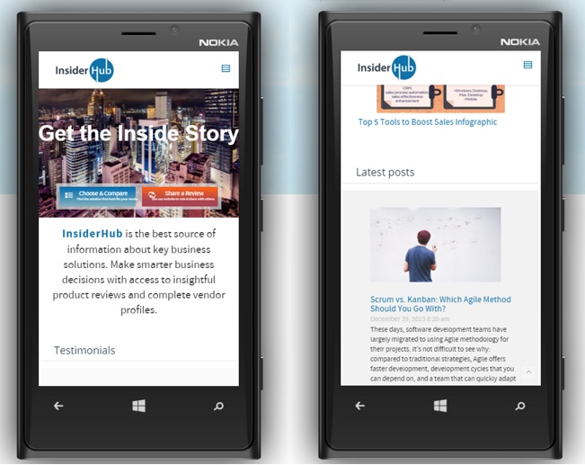
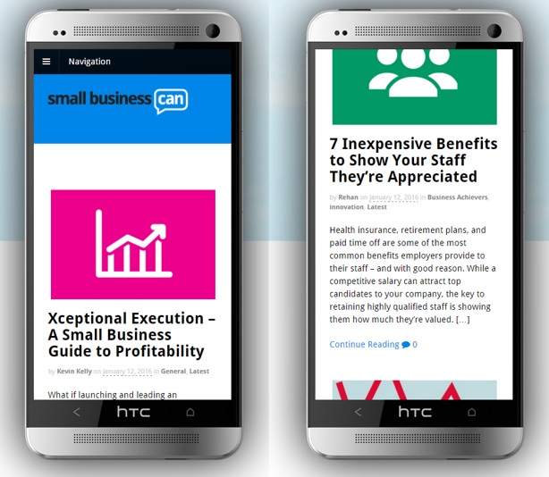
On the desktop versions of these sites, you’ll see fully customized themes that showcase the familiar functions of a blog that you would normally see, but the real magic is in the mobile experience. What will be noted is the site will look slightly altered from the web-version, but the functionality caters specifically to the smaller resolutions of a smartphone. This enables users to navigate and read your content much more efficiently while using their mobile browsers.
Responsive Themes
Responsive themes are WordPress themes that remain consistent on both web and mobile platforms, in terms of design and visual aesthetic. No matter the screen size or resolution, the theme functions in a flexible manner, adapting to a number of different screen resolutions while maintaining its original integrity.
Nowadays, responsive themes are growing in popularity and are steadily becoming the norm due to their ease of usability. To designers and users, this is the most appealing solution because of its ability to keep continuity from web and mobile versions of WordPress sites.
Both sites have the ability to remain similar in design while viewing on web and mobile, but on the mobile end more noticeably, you’ll see that all the important images and text resized and formatted to best suit mobile viewing.
Which solution is best for you?
Ultimately, there is no one-way to go about optimizing your site for mobile. As time progresses, we will surely see themes evolve and users will likely notice an even bigger push into mobile browsing. Some of the future things we may see are integrations of app-like features that deal with APIs and cross-application functionality with apps like Instagram, Twitter, and Facebook.
A recent study done by Google went on to show us that over half of internet users are unlikely to return to a website if the mobile experience was poor. This is the red-flag indicator that the past predictions were spot-on, with mobile experiences truly ushering in the future of where we are headed.
Anne Sampson is a freelance business consultant and a teaching associate. She is passionate about innovations and technologies that enrich and inspire learning and self growth process. When not too busy, she enjoys traveling, hiking and photography.
(https://www.linkedin.com/pub/anne-sampson/106/b43/707)